
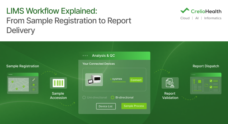


You probably know that roughly 70% of medical decisions rest on lab results. That number alone should tell you how much weight your LIS carries, as it touches almost every result that leaves your lab. And yet, most lab teams don’t actually know how their own system works. That’s what this guide is for. A LIMS workflow diagram is a visual map showing how your Laboratory Information System connects to and manages each step of the testing process, from sample registration through to result delivery.
That gap between “the LIS works” and “we can actually show you how it works” isn’t just an inconvenience. It shows up during accreditation visits, when an auditor asks you to walk through a process. It shows up during onboarding, when a new hire spends two weeks guessing which button does what. And it shows up the moment a bottleneck appears, and nobody on the team can point to where. By the end of this guide, you’ll know the phases every LIMS workflow diagram needs to cover, which diagram type fits your team, how to read the symbols on one, and how to build your own.
1. What Is a LIMS Workflow Diagram?
A LIMS workflow diagram is a structured visual representation of how a Laboratory Information System manages sample data, test orders, and results across each phase of lab operations.
That’s a different thing from a general lab flowchart:
- Flowchart: The process steps, what happens (collect sample, run test, release result)
- LIMS diagram: The system actions layered onto that process, what the software does at each step (registers automatically, routes itself, waits for a human to click “approve”)
Most of what a laboratory information system does happens quietly, between a barcode scan and a result appearing on a screen. A diagram pulls that logic into the open so you can see:
- Where automation kicks in
- Where two systems hand data to each other
- Where a step still depends on someone remembering to do it manually
Who typically uses one:
- Lab managers, to plan capacity
- IT teams, to document integrations
- Compliance officers, to prove a process matches the SOP on paper
- New staff, to get from confused to competent faster than any manual gets them there
When is the LIMS workflow diagram required the most:
- A new LIS implementation
- A workflow redesign
- Compliance audit prep
- Staff onboarding
I. LIMS vs LIS: Are They the Same Thing?
Technically, no. LIS is built around clinical reporting and patient management, while LIMS has broader functionalities. It covers sample tracking, reporting, billing, inventory, compliance documentation, medical data, and more.
In practice, diagnostic labs use the two terms interchangeably almost all the time. A pathology lab director and a research lab manager might both say “our LIMS” while describing systems with fairly different scopes. Both terms point at the same underlying idea: software that tracks a sample and its data from arrival to report.
Want to dig deeper into this distinction? Our guide on LIMS vs LIS vs LIMS-LIS Hybrid walks through how to decide which setup makes sense for your lab.
2. The 3 Core Phases Every LIMS Workflow Diagram Must Map
Every LIMS workflow diagram needs to cover three phases: pre-analytical (sample intake), analytical (testing), and post-analytical (reporting). These map directly to the three stages where your LIS automates, tracks, or validates work. Quick take on why each phase matters:
- Pre-analytical is where most of a LIS’s value goes unnoticed. Barcoding, routing rules, and demographic pulls happen so fast that staff stop thinking of them as “the system doing work.”
LIMS modules involved: Patient registration module, order management, barcode engine, automated routing rules.
- Analytical is where bidirectional instrument interfacing earns its keep. Results flow straight from the analyzer into the LIMS instead of being typed in by hand. Industry data on interfaced labs indicate transcription error reductions in the 95-98% range compared to manual entry.
LIMS modules involved: Sample life cycle management, instrument interfacing, QC module, auto result entry, and critical flagging.
- Post-analytical is where role-based authorization matters. Someone has to sign off before a result goes anywhere, and your diagram should show who, and how the LIMS then dispatches the report.
LIMS modules involved: Result validation engine, role-based approval, report templates, EHR/HL7 dispatch, archive and storage.
3. What Types of LIMS Workflow Diagrams Are There?
There are four main types of LIMS workflow diagrams: process flow diagrams, swimlane diagrams, integration maps, and state diagrams. The type you need depends on whether you’re trying to show steps, responsibilities, system connections, or sample status changes.
| Diagram Type | Key Feature | Best Used For | Purpose in LIMS Context |
| Process Flow Diagram | Linear, step-by-step LIMS actions | Documenting SOPs and regulatory audit trails | Shows LIMS actions in sequence |
| Swimlane Diagram | Lanes per LIMS module or department | Cross-functional labs, hospital core labs | Shows who owns each step |
| Integration Map | LIMS to instrument to EHR connections | Multi-site or system integration planning | Shows data handoffs between systems |
| State Diagram | Sample status changes tracked in LIMS | Specimen lifecycle management | Tracks sample states: registered, tested, archived |
I. Which Diagram Type Should A Lab Start With?
- Requirement: Running a clinical lab and this is your first diagram?
Solution: Start with a swimlane version. It shows your LIMS modules as lanes and is the easiest format for non-technical staff to read. - Requirement: On the IT or integration side?
Solution: Use an integration map. It documents every system connection, which matters the moment you’re troubleshooting a data flow issue. - Requirement: Preparing for an audit?
Solution: Go with a process flow diagram. It maps one-to-one against your SOPs.
4. How to Create a LIMS Workflow Diagram: A Step-by-Step Guide
Creating a LIMS workflow diagram takes four real steps: map your current process, identify where your LIS touches each step, choose a diagram type, and build it using diagramming software or your LIS’s built-in workflow tools.
- Map your current lab workflow without the LIMS first: Write out every step from sample receipt to result delivery, and be honest about which steps are still done by hand today.
- Identify every LIMS touchpoint: Go step by step and mark exactly where your system acts: registers, routes, tracks, validates, dispatches, or archives.
- Add instrument and system integration nodes: Mark every point where data moves between your LIMS and an instrument or external system, EHR, HIS, or billing platform.
- Choose your diagram type: Swimlane for team clarity, process flow for SOP documentation, integration map for your IT team.
- Build it: Software like Lucidchart, Microsoft Visio, and draw.io all work fine. Some LIMS platforms include configurable workflow management with a visual audit trail built in, so the diagram can come straight out of your live configuration instead of being drawn from scratch.
- Review it with the people who’ll actually use it: Walk it past a lab technologist and a pathologist before you publish it as an SOP. They’ll catch the step you missed.
5. How to Read a LIMS Workflow Diagram: Key Symbols and Notations
LIMS workflow diagrams use standard flowchart symbols combined with a few system-specific notations.
Standard symbols:
- Rectangle: A LIMS action or process step, like “barcode sample”
- Diamond: A decision point or conditional rule, like “QC passed?”
- Cylinder: A database or LIMS data store, such as patient records or a result archive
- Arrow: The direction data or a sample is moving
- Oval or rounded rectangle: The start or end of a workflow
- Dashed box: An external system, like an EHR, an instrument, or a patient portal
LIMS-specific notation conventions:
- Automation indicators: A lightning bolt or an “A” badge marking steps the LIMS handles on its own.
- Integration nodes: A double-arrow icon marking where two systems hand data to each other
- Role labels: A note next to a decision diamond showing who’s responsible: technologist, pathologist, or the system itself
- Status tags: Labels showing a sample’s state, registered, in progress, validated, dispatched
6. LIMS Workflow Diagrams by Lab Type: What Changes?
A LIMS workflow diagram for a clinical hospital lab looks noticeably different from one built for a molecular diagnostics lab. The core phases stay the same, but the number of steps, instrument integrations, and reporting routes shift depending on what you’re testing and how much volume you’re running.
| Lab Type | Key LIMS Diagram Feature | Volume / Complexity | Key Integration |
| Clinical / Hospital Lab | Multi-department swimlane, EHR integration dominant | High volume, multiple test types | HL7/EHR, PACS |
| Molecular Diagnostics | Extended analytical phase (PCR/NGS steps), data volume flags | Lower volume, complex protocols | Sequencing platforms, NGS LIMS |
| Pathology Lab | Digital pathology routing, slide tracking in LIS | Moderate volume, visual QC steps | Digital scanners, whole-slide imaging platforms |
| Multi-Site / Chain Lab | Hub-spoke routing, centralized LIMS with branch nodes | High volume across locations | Central LIMS plus branch LIS nodes |
What changes and why, at a glance:
- Hospital core labs run dense with EHR touchpoints, since results need to land in a patient’s chart the moment they’re validated, often through HL7 messaging.
- Molecular labs spend most of their diagram on the analytical phase, since a single PCR run or NGS workflow can involve a dozen sub-steps a standard chemistry test never touches.
- Pathology labs need slide tracking and whole-slide imaging routing, which a generic template misses entirely.
- Multi-site or chain labs need a hub-and-spoke structure showing how a central LIMS coordinates with branch-level systems.
7. What Can a LIMS Workflow Diagram Reveal About Your Lab’s Inefficiencies?
A LIMS workflow diagram tends to expose four kinds of hidden inefficiency: missing documentation steps, integration gaps, redundant manual processes, and bottleneck nodes where samples or data pile up.
- Missing documentation steps: any step with no LIMS action attached usually means staff are working outside the system, untracked and unaudited
- Integration gaps: an instrument or department with no LIMS connection is a manual data entry risk waiting to happen
- Redundant steps: double entry, manual result transcription, or approval loops that could be automated but haven’t been
- Bottleneck nodes: decision points where every sample converges on one person, like a single pathologist authorizing every report that comes through
- Manual override points: places where staff have quietly built a workaround to the LIS, usually a sign the workflow was configured wrong, not that the staff are doing something wrong

